
Why contrast is the right place to start
Most introductions to color theory start with the color wheel: complementary pairs, split-complementary triads, warm versus cool. That's a real subject and it matters for mood and brand — but almost none of it is testable. Two designers can disagree forever about whether a palette "feels right," and both can be correct, because taste isn't a spec.
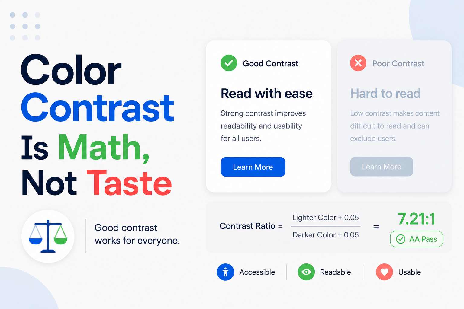
Contrast is different. It's the one part of color theory with an actual number attached, defined by an open standard, calculated the same way every time from the two colors involved. A palette either meets 4.5:1 for its body text or it doesn't — that's not a design opinion, it's arithmetic. That makes contrast the most defensible place to start learning color for interfaces, for the same reason whitespace is the most defensible place to start learning layout: there's no taste to hide behind.
What a contrast ratio actually is
A contrast ratio compares the relative luminance — perceived brightness, not just hue — of two colors, expressed as a ratio from 1:1 (identical colors, no contrast at all) up to 21:1 (pure black on pure white, the maximum possible). It's calculated from each color's RGB values, weighted toward green because the human eye is more sensitive to green light than to red or blue.
The formula itself is deliberately boring to compute by hand and easy to check with a tool: a browser's built-in accessibility inspector, a Figma or Adobe XD contrast plugin, or any free online contrast checker will take two hex codes and return a single number. The formula matters less than the habit of actually running it, on every text-and-background pairing before shipping, instead of estimating it by eye.
The numbers that actually matter
WCAG's Level AA contrast requirement — the bar most teams should treat as non-negotiable — is 4.5:1 for normal body text against its background. Large text gets a lower bar of 3:1, where "large" specifically means 18pt (24px) regular weight or 14pt (about 18.5px) bold and up; text that size stays legible even with less contrast behind it.
A second, newer rule — non-text contrast, added in WCAG 2.1 — requires 3:1 for the visual elements that let someone identify a UI component or its state: button borders, form field outlines, checkbox and radio button edges, focus indicators. Icons and infographic elements carrying real meaning fall under this too. It's the rule teams miss most often, because it's easy to obsess over text contrast and still ship a form with a border so faint it's nearly invisible.
A stricter tier — Level AAA — exists above that: 7:1 for normal text, 4.5:1 for large text. It's worth targeting for body copy on content-heavy products, but treat AA as the floor to clear on everything, not the goal to aim for on the easy cases.
What gets a pass, and why
WCAG explicitly exempts a few things from these minimums: disabled controls, purely decorative elements, logos and brand marks, and text that's baked into an image with no other way to present it. That exemption exists because a disabled button communicates its state through more than color alone — it's also unclickable, typically paired with a "not-allowed" cursor and a consistent reduced-opacity treatment — not because low contrast is fine whenever it's inconvenient to fix.
The practical takeaway: check every functional element a person actually needs to read or operate — labels, inputs, buttons, links, error text, chart lines, status badges — and treat "it's decorative" as a narrow exception that needs a real justification, not a default excuse for skipping the check.
Color alone is never enough
Roughly 1 in 12 men and 1 in 200 women have some form of color vision deficiency, most commonly reduced sensitivity to red or green. A palette can pass every contrast check and still fail these users if the interface's only signal for meaning is hue — a red-versus-green status dot at identical lightness and saturation, for instance, can look nearly identical to a meaningful share of a real audience.
The relevant rule is simple to state and easy to forget in the middle of a busy screen: never use color as the only visual means of conveying information. A form error needs a colored border and an icon and a text message, not just a color change. A chart needs distinct line styles or direct labels, not just distinct hues. This is a cheap fix when it's designed in from the start and an expensive one to retrofit across a shipped product.
Building a scale instead of picking colors one at a time
Choosing individual colors ad hoc — this blue for the button, a slightly different blue for the link, another for the focus ring — produces the same problem one-off spacing values do: nothing is reusable, and nothing gets checked systematically. The fix is the same too: build a numbered scale instead of a pile of loose hex codes.
A typical approach generates nine or ten steps per hue, often labeled 50 through 900, running from a near-white tint to a near-black shade at consistent lightness intervals rather than eyeballed jumps. One brand hue run through that scale produces every tint and shade a product actually needs — hover states, backgrounds, borders, disabled states — without anyone picking a fresh color for each new situation.
Grayscale gets the exact same treatment: a numbered neutral scale for text, borders, and surfaces, instead of a slightly different gray chosen for every component that happens to need one. Most of an interface's contrast work is actually gray-on-gray or gray-on-white, so the neutral scale tends to matter more day-to-day than the brand hue does.
Naming colors by role, not by hue
A hex code tells you nothing about what a color is for. The fix, borrowed from design systems work, is semantic naming: instead of styling a button with #1D5FD6 directly, define a token — action, or action-primary — that currently resolves to that hex value, and reference the token everywhere a "primary action color" is needed.
That does two things a raw hex code can't. First, it documents intent: a developer reading action-danger in code knows what the color means without opening a design file. Second, it makes the color swappable in exactly one place — adjust an accent hue once, and every button, link, and focus ring built on that token updates together, still passing whatever contrast check was run against that role originally.
A reasonably complete role set covers text (primary, muted, inverse), surface (background, card, overlay), border, and status (action, success, warning, danger) — each with a light-mode value and, where relevant, a separate dark-mode value, each pre-checked against the surfaces it's actually meant to sit on.
Dark mode is a second palette, not an inverted one
Simply inverting or dimming a light palette for dark mode breaks contrast math that was calculated for a specific pair of colors. A light gray that hit 4.5:1 against white can fail badly against a near-black background, and a saturated brand blue that looked crisp on white frequently reads as harsh, or seems to vibrate, against a dark surface.
Treat dark mode as its own set of token values, checked against its own set of surfaces, not a filter applied to the light set. In practice this usually means desaturating and lightening brand hues slightly for dark backgrounds, and choosing a near-black rather than a pure-black base surface — pure black behind bright text can itself feel harsh and, counterintuitively, can hurt readability compared to a very dark gray.
Every semantic token from the previous section needs a dark-mode value defined and contrast-checked the same way its light-mode counterpart was — never assumed to inherit acceptable contrast just because the light version happened to pass.
Auditing a palette you didn't build
Given any existing product, list every distinct text-and-background pairing that actually appears on screen — body copy, muted captions, placeholder text, button labels, link text — and run each one through a contrast checker. Anything under 4.5:1 (or 3:1 for genuinely large text) goes on a fix list, sorted by how often that pairing shows up across the product.
Next, check every interactive element's border and focus indicator against its background at 3:1. Focus indicators deserve extra attention here: they're the pairing most likely to have been styled once, early, and never revisited, even as the surrounding palette kept changing around them.
Finally, find anywhere meaning is carried by color alone — status dots, chart lines, form validation states — and confirm each one has a second, non-color signal. A spacing audit tends to surface accidental inconsistency; a contrast audit tends to surface accidental exclusion, which is a different kind of bug, but just as real.
Where this leads next
Contrast is a useful entry point into color for the same reason whitespace is a useful entry point into layout: it replaces a purely aesthetic judgment with a number anyone can check, which makes it possible to actually get better at the skill instead of just developing more confident taste.
Once contrast ratios and semantic tokens feel automatic, the rest of color theory — hue relationships, saturation, the emotional weight of a palette — becomes something layered on top of a system that already passes its basic checks, rather than a replacement for checking at all. The wheel is still worth learning. It's just not where the guarantees come from.