
Why a type scale is the right place to start
Most people treat font size as a series of independent decisions — this heading looks about right at 28px, that caption feels fine at 12px — chosen one at a time by eye, the same way ad-hoc spacing values get chosen one at a time by eye. The result is the same problem too: a page full of sizes that don't relate to each other in any way a person, or a stylesheet, can predict.
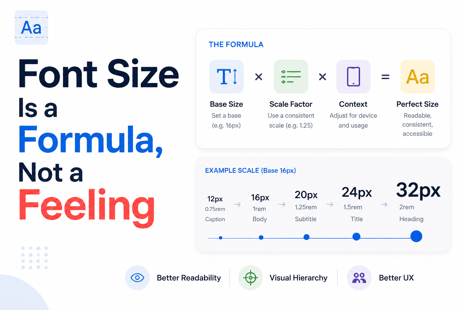
A type scale replaces that guessing with a formula: pick one base size and one ratio, and every other size on the page is derived from those two numbers instead of invented separately. Two designers working from the same base and ratio produce identical scales without ever comparing notes — the same property that made whitespace and contrast worth learning first. The answer is checkable, not just defensible.
What a modular scale actually is
A modular scale multiplies a base size by a fixed ratio, once per step: size = base × ratio^n. Starting from a 16px base and a 1.25 ratio, the next step up is 16 × 1.25 = 20px, then 20 × 1.25 = 25px, then roughly 31px, and so on in both directions — down toward small caption sizes as well as up toward display headings.
The ratios most type-scale tools ship with by default are small, named intervals borrowed from music theory: 1.125 ("major second"), 1.25 ("major third"), 1.333 ("perfect fourth"), and 1.618 (the golden ratio) are the four worth knowing. A smaller ratio produces a tighter, more subtle scale suited to dense interfaces; a larger ratio produces more dramatic jumps suited to editorial or marketing pages where a heading needs to command real visual weight.
Picking a base size and a ratio
16px is the de facto standard base size for body text on the web — it's the default a browser applies with no CSS at all, and dropping below it on any real block of reading text makes a page measurably harder to read for most people, not just those with low vision. Treat 16px as a floor for body copy, not a starting point to shrink from when a layout feels crowded.
On mobile specifically, 16px isn't just a readability preference: iOS Safari automatically zooms the viewport when a tapped input's font size is smaller than 16px, an easy bug to introduce by accident on a form field and one worth checking for directly, since the zoom itself often gets blamed on something else during QA.
Ratio choice should track content density the same way a spacing scale's density tracks its interface: a tight ratio like 1.125 or 1.2 suits data-dense dashboards and admin tools, where too many competing sizes on one screen creates noise; a looser ratio like 1.5 or 1.618 suits marketing pages and long-form articles, where a heading is meant to dominate the page it sits on.
Line-height belongs to the scale, not to taste
Line-height needs its own rule, and it moves in the opposite direction from font size: as text gets larger, it needs proportionally less line-height, not more. Body copy at 16px typically wants a line-height around 1.5–1.6 times its font size; a 48px display heading at that same 1.5 ratio would leave enormous, awkward gaps between lines that a reader never asked for.
A practical rule holds across most scales: tighten line-height as size increases — roughly 1.1–1.3 for large display headings, 1.3–1.4 for subheadings, and 1.5–1.6 for body text and captions. Treat line-height as a second column on the same scale table as font size, not a value chosen separately for each new component that happens to need text.
This isn't only an aesthetic default. WCAG's text-spacing criterion specifically expects line-height to reach at least 1.5 times the font size for body text without breaking the layout, on the reasoning that many users with low vision or reading disabilities rely on browser or assistive-technology settings to force exactly that spacing.
Measure: the line length nobody sets on purpose
Measure is the line length of a paragraph, and it's one of the most consistently under-designed properties on the web, because unlike font size or color, nothing renders visibly wrong when it's ignored — a paragraph that stretches the full width of a wide browser window doesn't throw an error, it just becomes measurably harder to track from the end of one line to the start of the next.
The commonly cited comfortable range is 45 to 75 characters per line, with roughly 66 characters treated as the sweet spot for sustained reading — a range that traces back to classic print typography and holds up consistently in web-readability research. In practical CSS terms this usually lands around a max-width of 60–75ch on a body-copy container, not a fixed pixel width that stops working the moment the font size or the viewport changes.
Below that range, eyes bounce line to line too often and reading feels choppy; above it, especially past 90–100 characters, a reader's eye can lose its place finding the start of the next line — a problem that gets measurably worse at wide desktop widths, where a single unconstrained paragraph can run past 120 characters per line.
Fluid type: scaling without breakpoints
A traditional responsive approach sets a handful of fixed sizes and swaps between them at breakpoints, which means a heading is 32px right up until a 768px breakpoint and instantly 24px one pixel below it. Fluid type replaces those hard jumps with a formula that scales continuously between a minimum and a maximum, using CSS's clamp() function: clamp(minimum, preferred, maximum).
A typical fluid heading declaration looks like font-size: clamp(1.5rem, 1.2rem + 2vw, 3rem) — never smaller than 1.5rem, never larger than 3rem, and smoothly interpolated between those bounds based on viewport width in between. The result is a heading that resizes at exactly the same rate the browser window does, with no visible jump at any particular width and no breakpoint to maintain as new screen sizes show up.
Apply clamp() to a handful of key sizes — the largest headings and hero text see the most benefit — rather than to every step of the scale; body text at 16px rarely needs to grow much across viewports, and forcing it to flex adds complexity without a real readability gain.
Naming the scale and pairing typefaces
Give each step a name instead of writing raw rem or pixel values into code: text-xs, text-sm, text-base, text-lg, text-xl, text-2xl, text-3xl, and so on, each mapped to one value from the scale. That turns "what size is this" into a lookup from a short list — the same discipline a named spacing scale brings to gaps and padding.
One well-made typeface is enough for most interfaces; two is the practical ceiling for almost everyone else — a body typeface and a distinct display or heading typeface, chosen for contrast rather than similarity. Pairing a serif display face with a sans body face, or a geometric sans with a humanist one, reads as an intentional choice; pairing two similar-but-not-identical sans faces usually just reads as a mistake.
If code or data needs its own treatment, a monospace typeface is worth adding as a third, clearly scoped exception — never as a stylistic alternative to the body face, only for the specific job, like code or tabular numbers, that a fixed-width face is actually good at.
Accessibility minimums text needs to clear
WCAG's resize-text criterion requires that text can be scaled up to 200% by a user, using nothing but standard browser zoom, without losing content or breaking functionality — a requirement that quietly rules out fixed-height containers with overflow hidden wrapped around anything that holds real text.
A separate text-spacing criterion sets minimums a user must be able to apply on top of a site's own styles without anything breaking: line-height at least 1.5 times the font size, space after paragraphs at least 2 times the font size, letter spacing at least 0.12 times the font size, and word spacing at least 0.16 times the font size. Designing to these ratios as defaults, rather than treating them as an edge case a user might force later, means a site already passes before anyone overrides anything.
A few more minimums round this out: never disable pinch-to-zoom with user-scalable=no in a viewport meta tag, avoid justified text on the web (variable-width justification produces uneven word gaps that particularly hurt readers with dyslexia), and use all-caps sparingly on anything longer than a short label — long stretches of capital letters remove the word-shape cues a reader normally relies on and measurably slow reading speed.
Auditing type on a screen you didn't design
Pick any existing screen and list every distinct font size actually in use. If that list has no relationship to a consistent ratio — 13px next to 15px next to 22px, none of them derived from the others — the sizes were picked by eye during a rushed handoff, the same way an unaudited spacing scale usually was.
Check line-height next: does it get tighter as size increases, or is one value applied everywhere regardless of size? A uniform line-height across headings and body text is one of the fastest tells that leading was never actually designed, just left at a framework's default.
Finally, measure actual line length on the widest body-text container on the page. Anything reliably running past 90–100 characters per line on a standard desktop viewport is a real readability bug, not a stylistic choice, and usually the cheapest fix on the entire list — a single max-width change on one container, rather than a full pass through the type scale.
Where this leads next
A type scale is worth learning early for the same reason whitespace and contrast are: it replaces a size-by-size guess with a formula that produces every other value on the page automatically, and that formula is exactly as checkable as a contrast ratio or a spacing token — a size either belongs to the scale or it doesn't.
Once base, ratio, line-height, and measure feel automatic, the remaining craft of typography — voice, texture, the specific character of a typeface — sits on top of a system that already gets the mechanics right, rather than trying to compensate for a page where nothing was actually decided on purpose.